

Overview
In this tutorial, we will learn about the HIPO Chart. The HIPO acronym stands for Hierarchy + Input-Process-Output. The HIPO chart is a programming design tool used in systems analysis and design. It resembles an organizational chart and helps us understand the system structure.
What is the HIPO Chart?
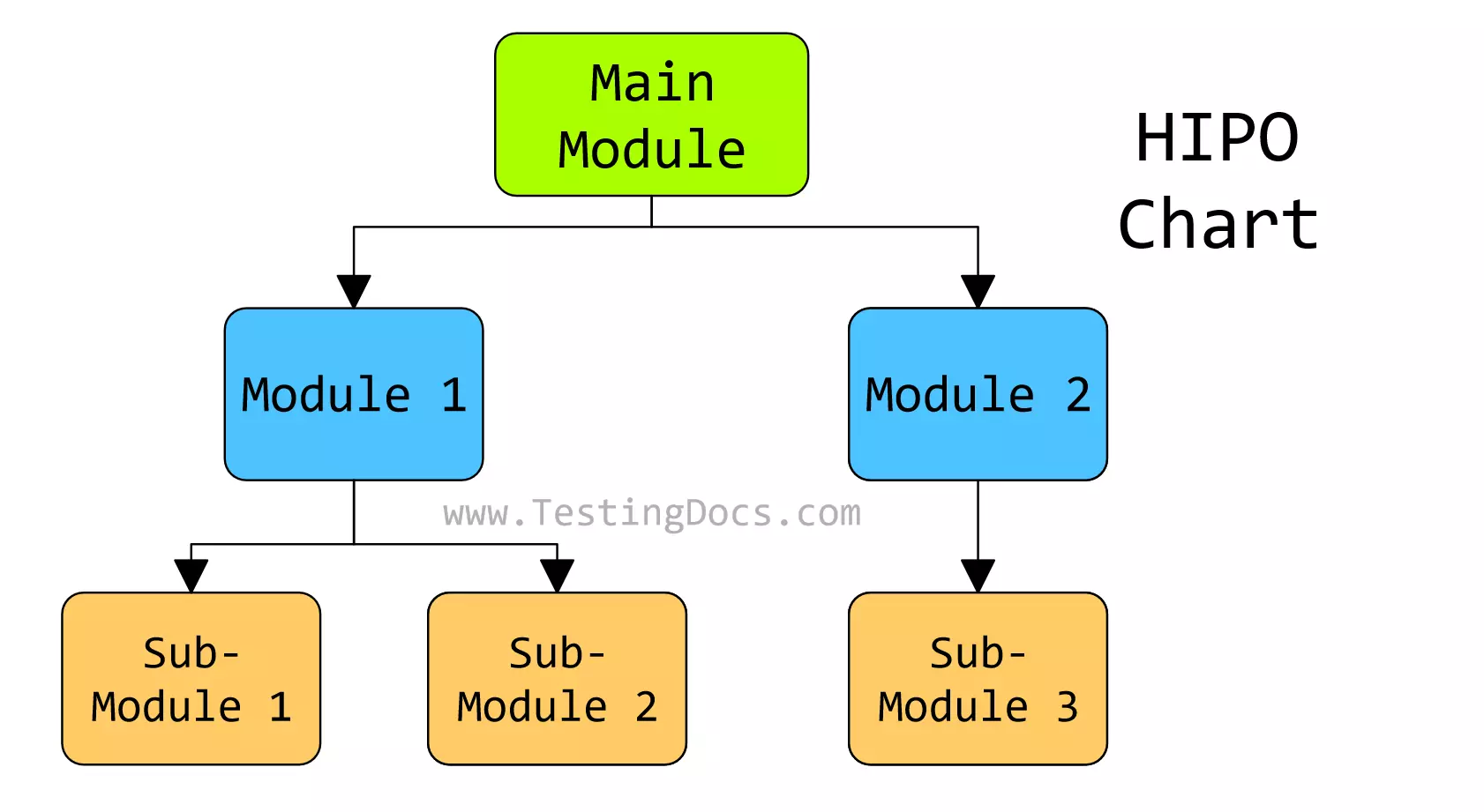
The chart displays the overall program structure. It visually represents the hierarchy of modules in a system, along with their input, process, and output data.
Hierarchy Chart: This shows the overall system and how various modules or functions are hierarchically related. For each module, it lists the IPO Chart(Input-Process-Output)

This tool is used during the program design or the initial planning phase. There are several names for this chart. A hierarchy chart is also known as:
🎯 Structure Chart
🎯 Top-down chart
Structure charts because the chart displays the overall program structure. Top-down chart because the tool is used during top-down program development approach.
The Structure chart is high-level and only shows the program’s organization. It breaks the program into modules and sub-modules and displays how the program modules are related to each other. It doesn’t go into implementation or processing details. This chart is prepared before writing the program code.
The Top-down chart is read from the top to the bottom and from the left to the right direction.
Advantages
HIPO diagrams help organize a software system’s modules in a hierarchical structure. They provide a high-level overview of the system’s functions and allow for further division of functions into sub-functions. HIPO diagrams are also an excellent tool for documentation purposes.
HIPO charts help plan and communicate system designs, especially in understanding complex software systems or introducing new team members to an existing system structure. They help visualize the data flow and dependencies between different system parts.