

Overview
In this tutorial, we will learn how to create line charts using an Excel application. As a tester, this information is useful while reporting testing metrics, testing data, or other important data, etc. There are several tools and libraries to perform this task. However, we will look at manual steps to create a Line chart using excel
Create Line charts
The steps for creating Line charts using MS Excel are as follows:
Launch the Excel application.
Create an excel sheet with the reporting data as shown in the below picture.
Below is the sample data of TestingDocs.com ( this website ) data for a period of six months. Two metrics that are measured are the first-time users of the website and returning users of the website.
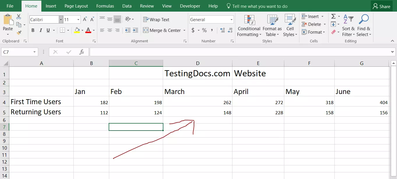

Highlight the data to be included in the graph.
Click on the Insert tab of the ribbon.
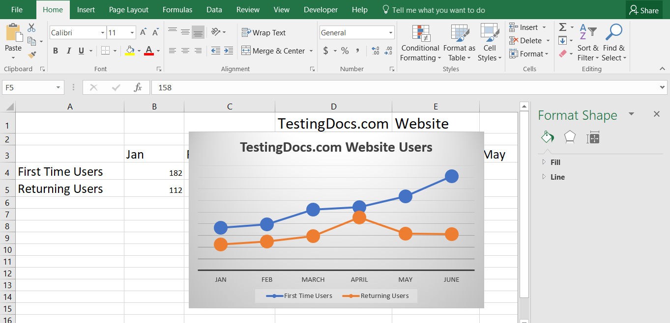
Click on the Insert Line Chart icon to open the drop-down of available chart types.

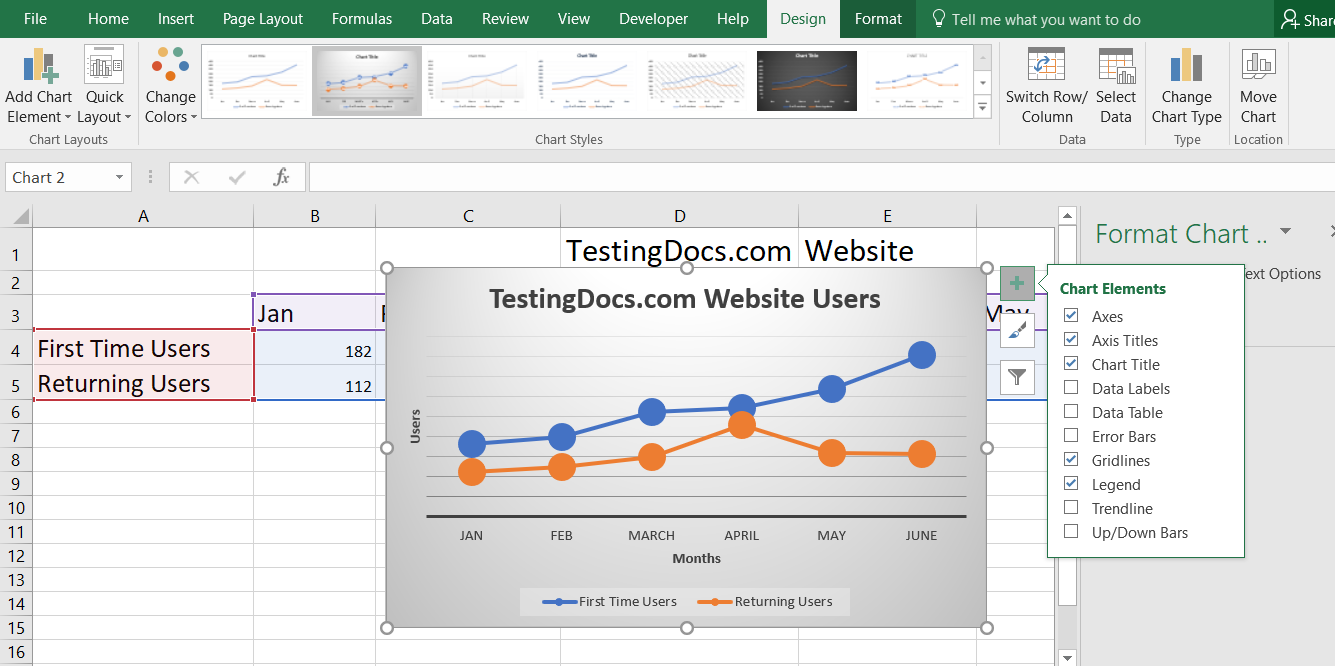
Filter the data included in the Chart
Filter icon enables you to choose the elements that you want to appear in the chart. ( this step is for additional customization of the chart.)
Click on Apply button to apply the changes.
You can add Chart data like axis information, legend etc.
Double-click on the chart title to modify it.

Now you will be able to visualize the data easily which makes it easy for others to understand the data and its trends.