Introduction
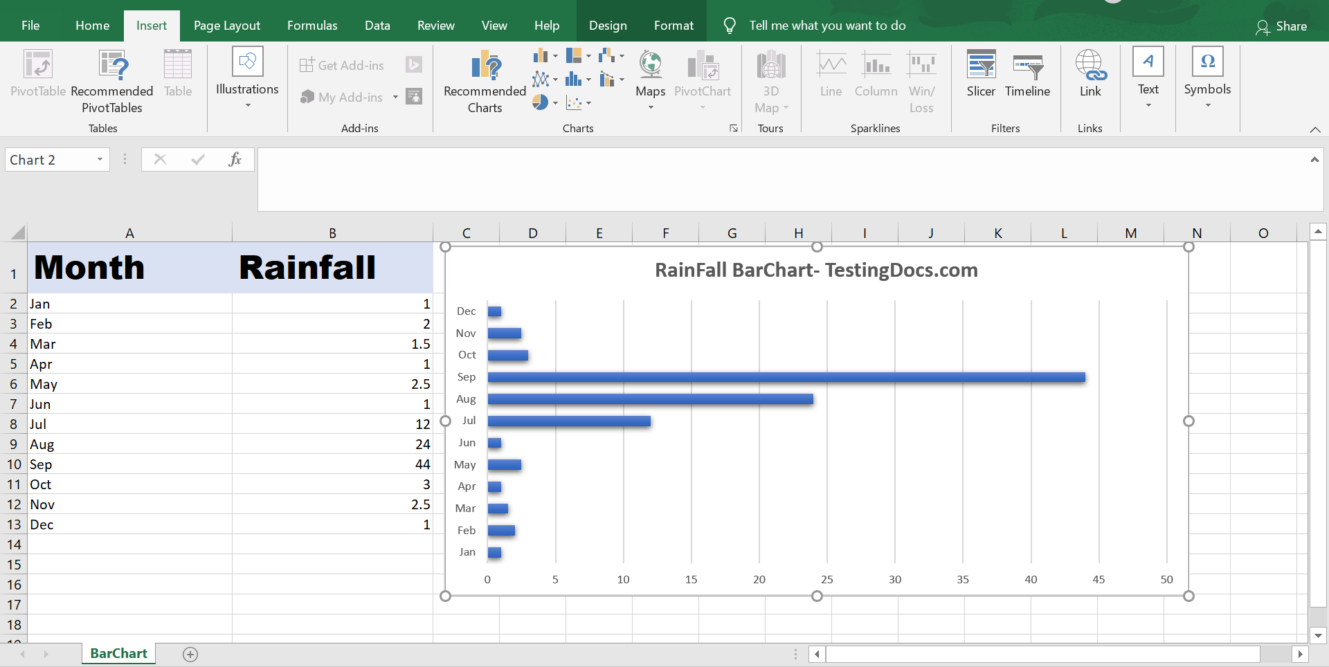
We use a Bar chart or Column chart to visually compare values for the given categories in the data. In this tutorial, we will learn steps to add a Bar chart using Excel Application for a sample set of data.
Sample Data
Sample rainfall data for the months on a particular year. We will create a bar chart for the data.
| Month | Rainfall |
| Jan | 1 |
| Feb | 2 |
| Mar | 1.5 |
| Apr | 1 |
| May | 2.5 |
| Jun | 1 |
| Jul | 12 |
| Aug | 24 |
| Sep | 44 |
| Oct | 3 |
| Nov | 2.5 |
| Dec | 1 |
Steps to create a Bar chart
- Launch Excel Application.
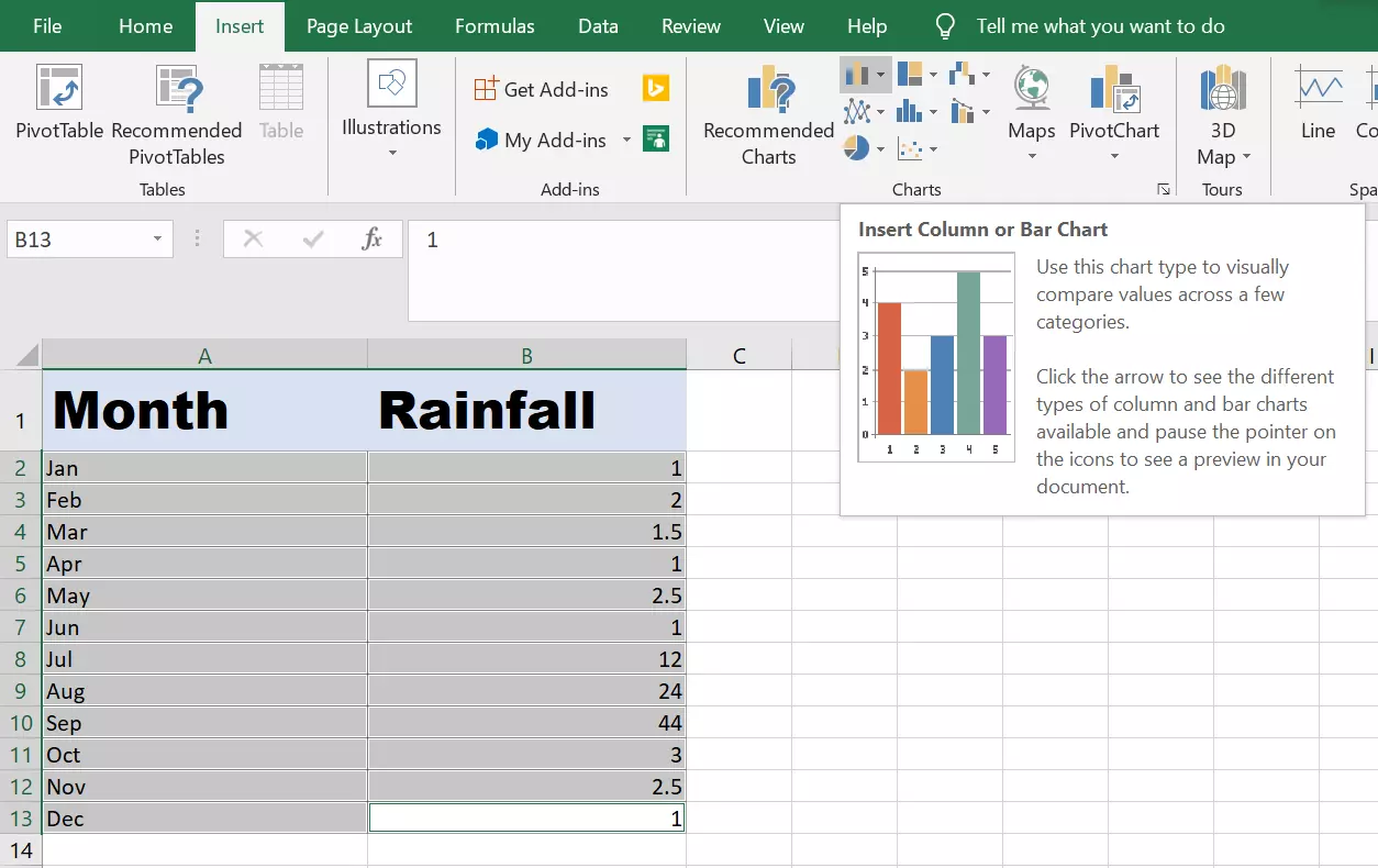
- Select the data in the Excel sheet.
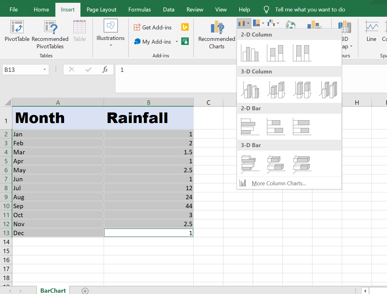
- Choose Insert >> Insert Column chart or Bar chart.

Select the Type of the Bar chart 2d, 3d or Stacked, etc.

Add the chart, resize, Add Title, and drag and drop to suitable location on the sheet.
Screenshot