How to create Line chart in Excel
Introduction
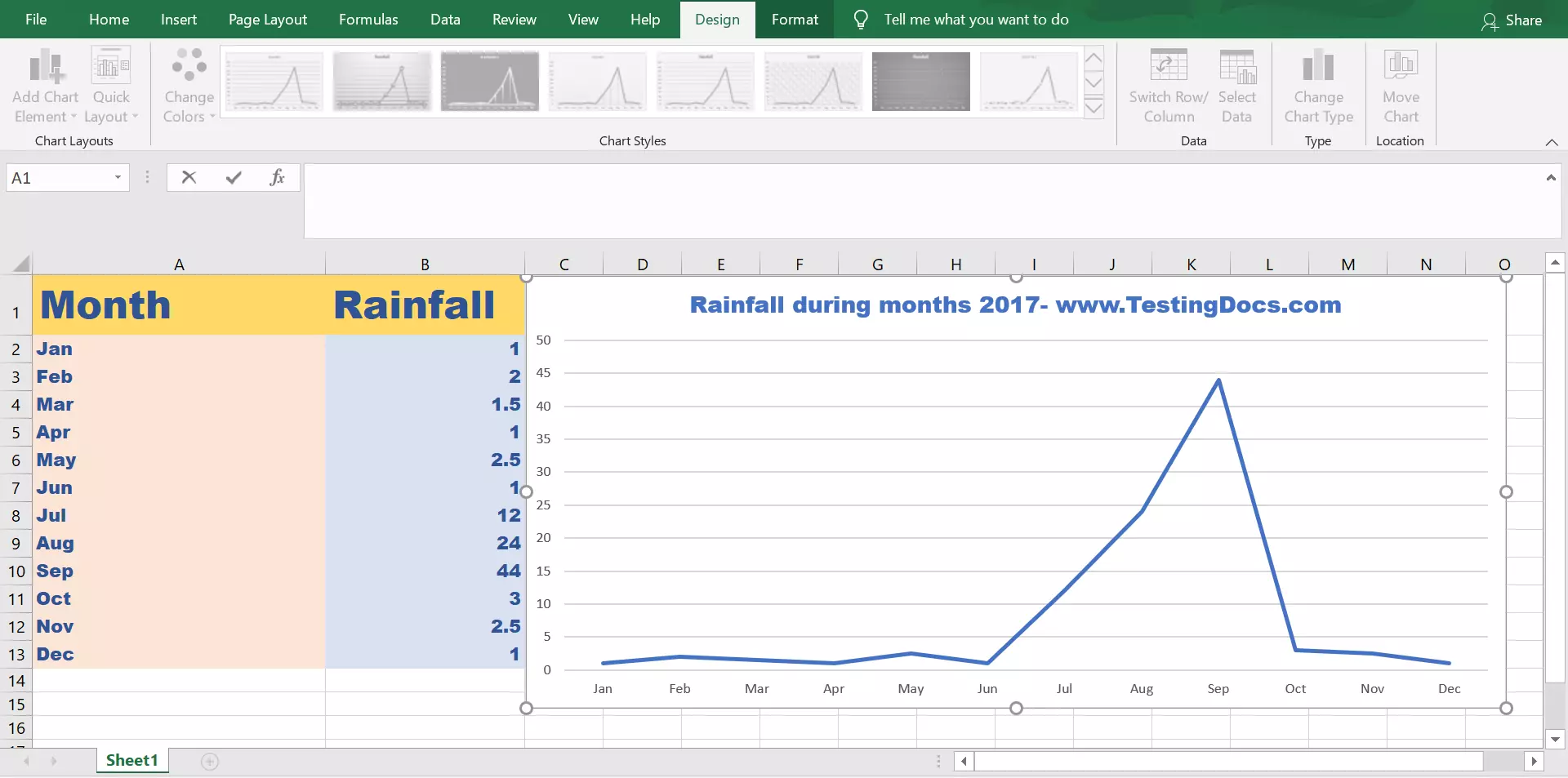
We use a Line chart to visually see the trends in the data over a period of time in the data. In this tutorial, we will learn steps to add a Line chart using Excel Application for a sample set of data.
Sample Data
Sample rainfall data for the months on a particular year. We will create a line chart for the rainfall data and see the trends over the period.
| Month | Rainfall |
| Jan | 1 |
| Feb | 2 |
| Mar | 1.5 |
| Apr | 1 |
| May | 2.5 |
| Jun | 1 |
| Jul | 12 |
| Aug | 24 |
| Sep | 44 |
| Oct | 3 |
| Nov | 2.5 |
| Dec | 1 |
Steps to create a Line chart
- Launch Excel Application.
- Select the data in the Excel sheet.
- Choose Insert >> Insert Line or Area chart.
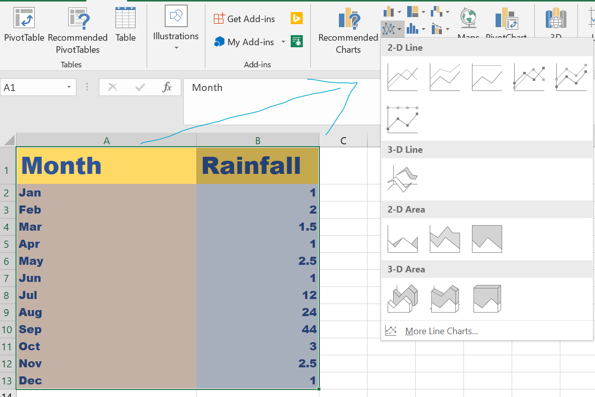
Select the Type of the Line chart 2d, 3d or Stacked, etc. There are different variations and various styles from the top ribbon.
We can add the chart, resize, add chart title, and drag and drop to a suitable location on the excel sheet.
Screenshot